Why we build a
design system
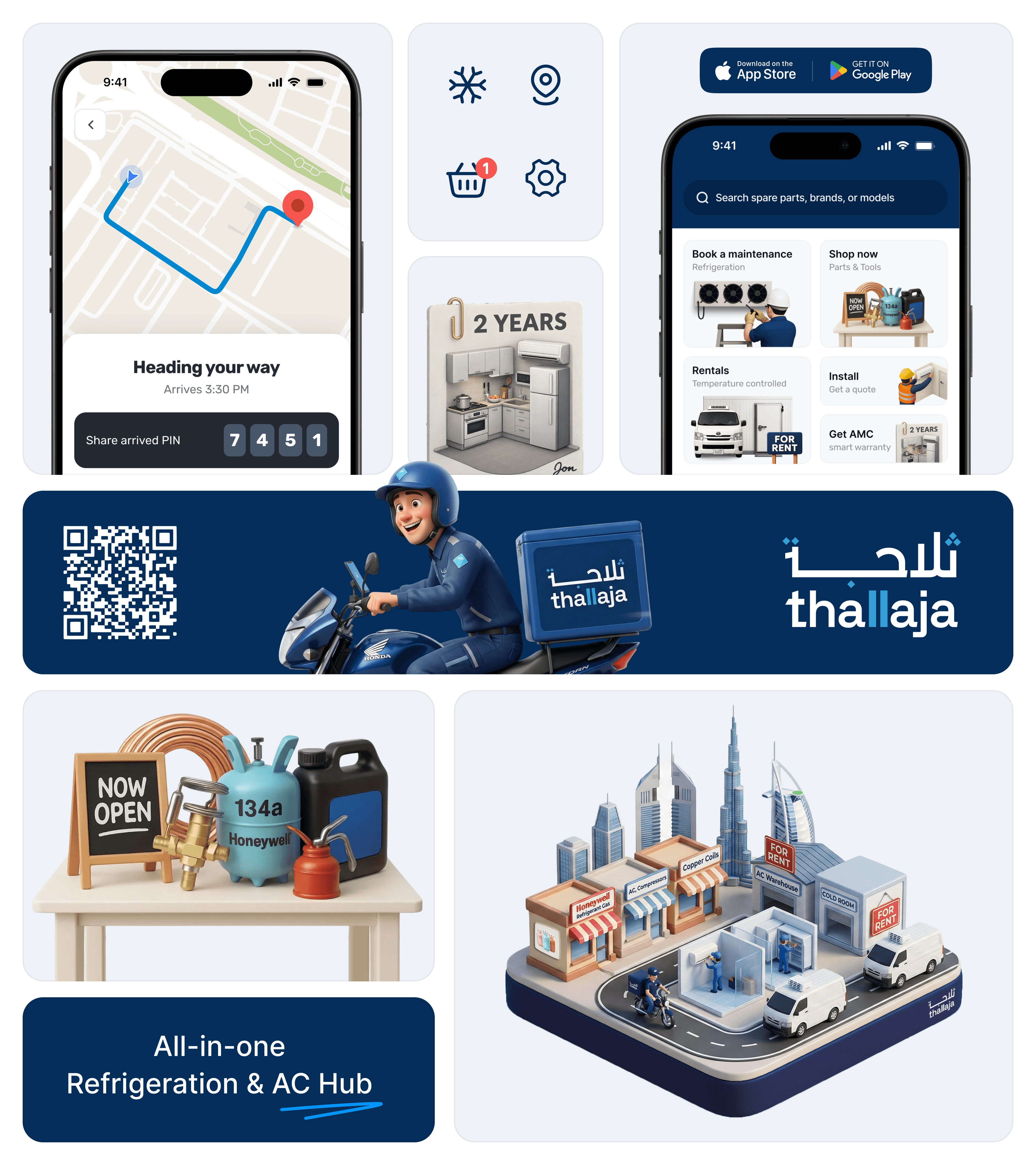
The chain from production unit to the market!
As the product rapidly expanded into multiple modules, maintaining consistency across the platform became increasingly difficult. The system included maintenance, rentals, e-commerce, AMC management, cold room installations, and air-conditioning operations, each requiring unique workflows and interfaces.
Initially, screens were designed individually without a unified system layer, which led to inconsistent UI patterns, repeated components, and slower design decisions. As a solo designer working on multiple operational modules, scaling the product efficiently became challenging.
To solve this, we introduced a scalable design system that standardized components, typography, colors, spacing, and interaction patterns across the platform. This helped create consistency between products, simplified collaboration with developers, reduced repetitive work, and accelerated future product development.
Consistency
Creating unified visual and interaction patterns across every module to ensure a predictable and seamless user experience.
Scalability
Building flexible foundations that support future product expansion, new modules, and evolving operational requirements.
Efficiency
Reducing repetitive design and development work through reusable components, tokens, and standardized patterns.
Collaboration
Improving alignment between design and development teams with a shared system language and structured documentation.