View complete design system case study

Thall- aja - The Service App

Thall- aja - The Service App

Thall- aja - The Service App

Thall- aja - The Service App

Role

Product Designer

Year

2026

Tools

Figma, Miro

Team

3

Tools

Figma, Miro

Team

3

From messy operations to one clear digital system experience, an all-in-one refrigeration & AC service platform built for the Emirates.

Scope of Work

Ux Stategy
Ui Design
Performance Metrix
Dev Handoff

How we solved emergency and scheduled maintenance booking for AC units, refrigerators, cold rooms, and reefer vehicles - across two apps: one for customers, one for technician

The Cold Storage,
Industry.

The chain from production unit to the market!
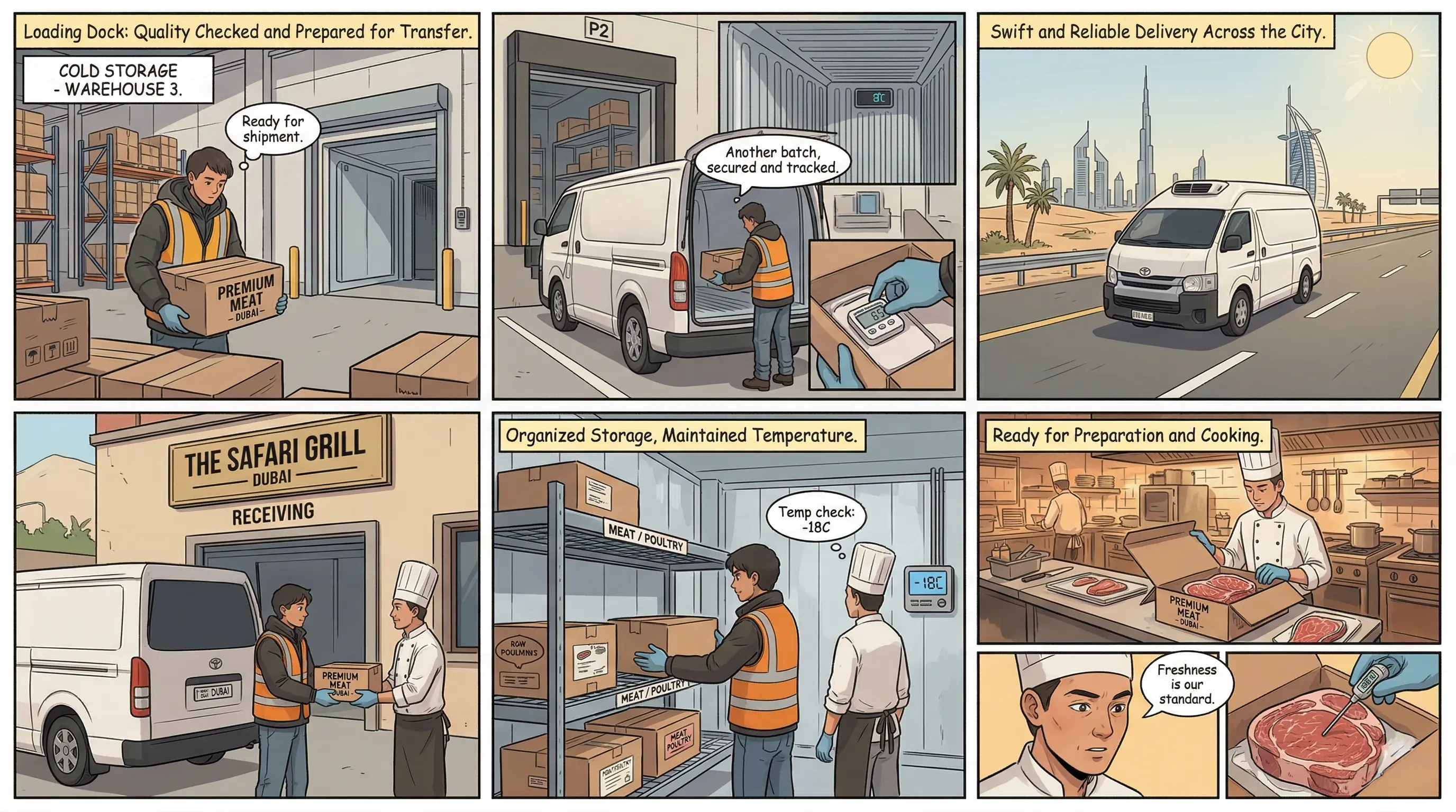
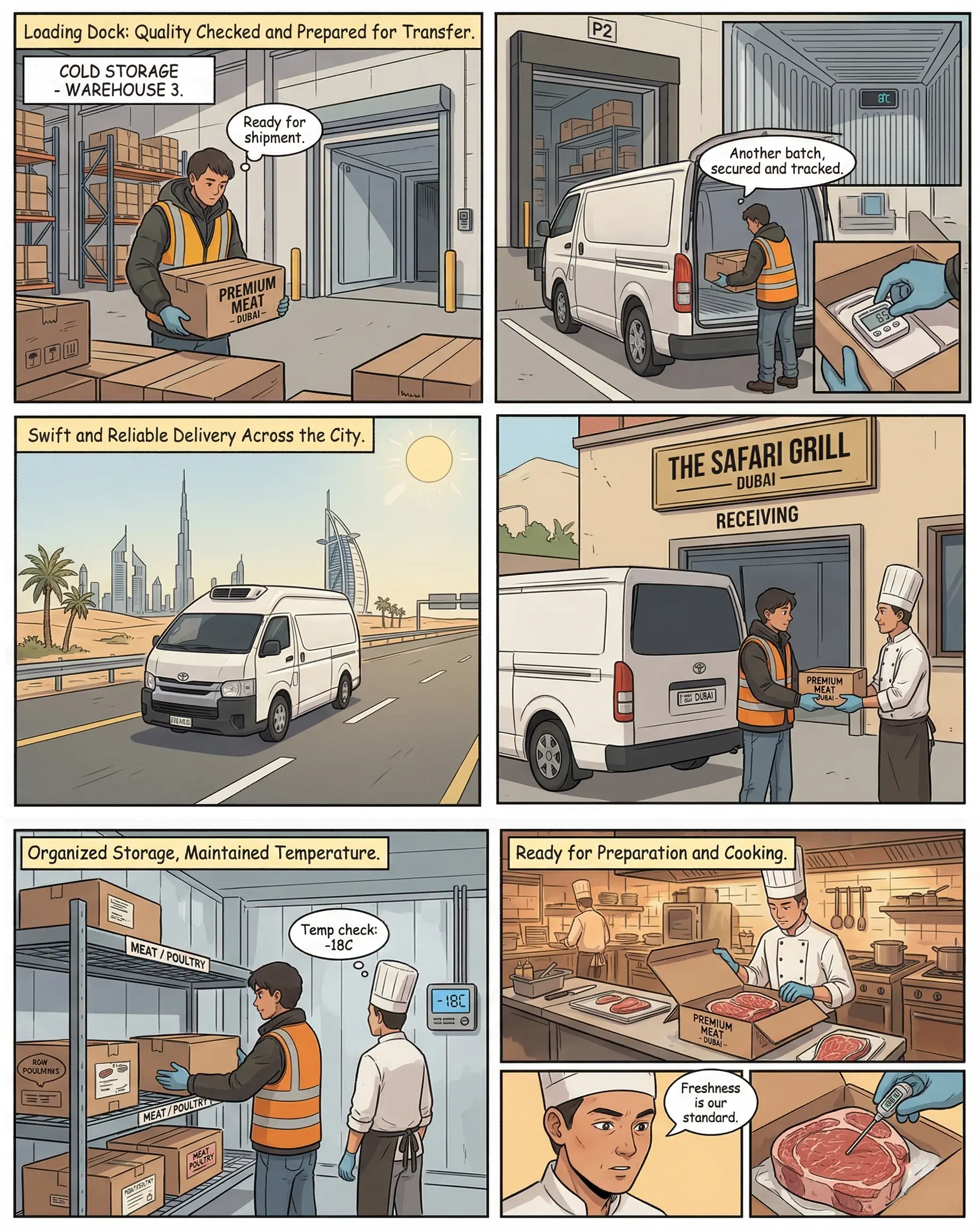
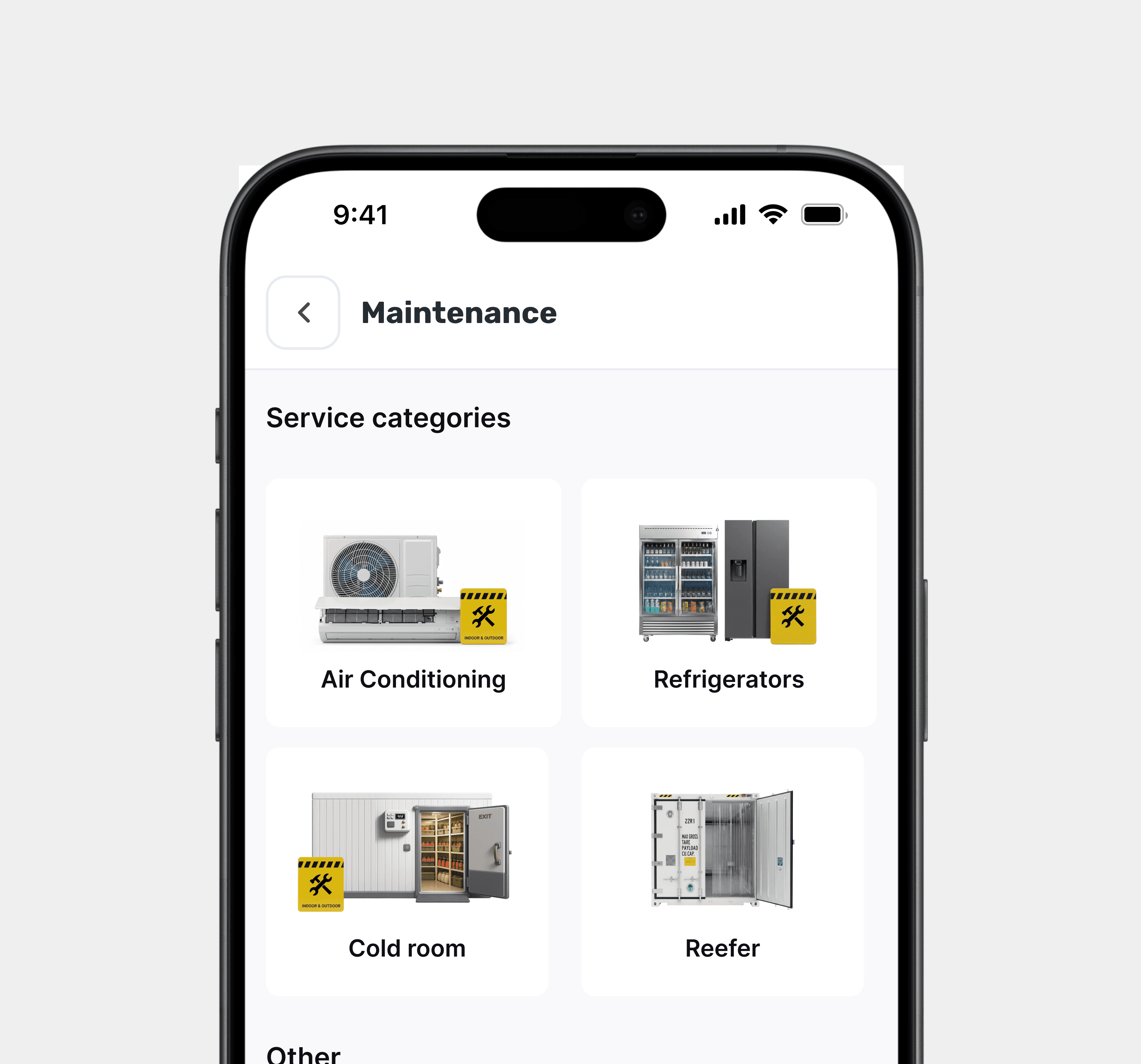
Cold Storage

Specialized warehouses using insulated panels and industrial refrigeration (chilled, frozen, or deep-freeze) to store goods.
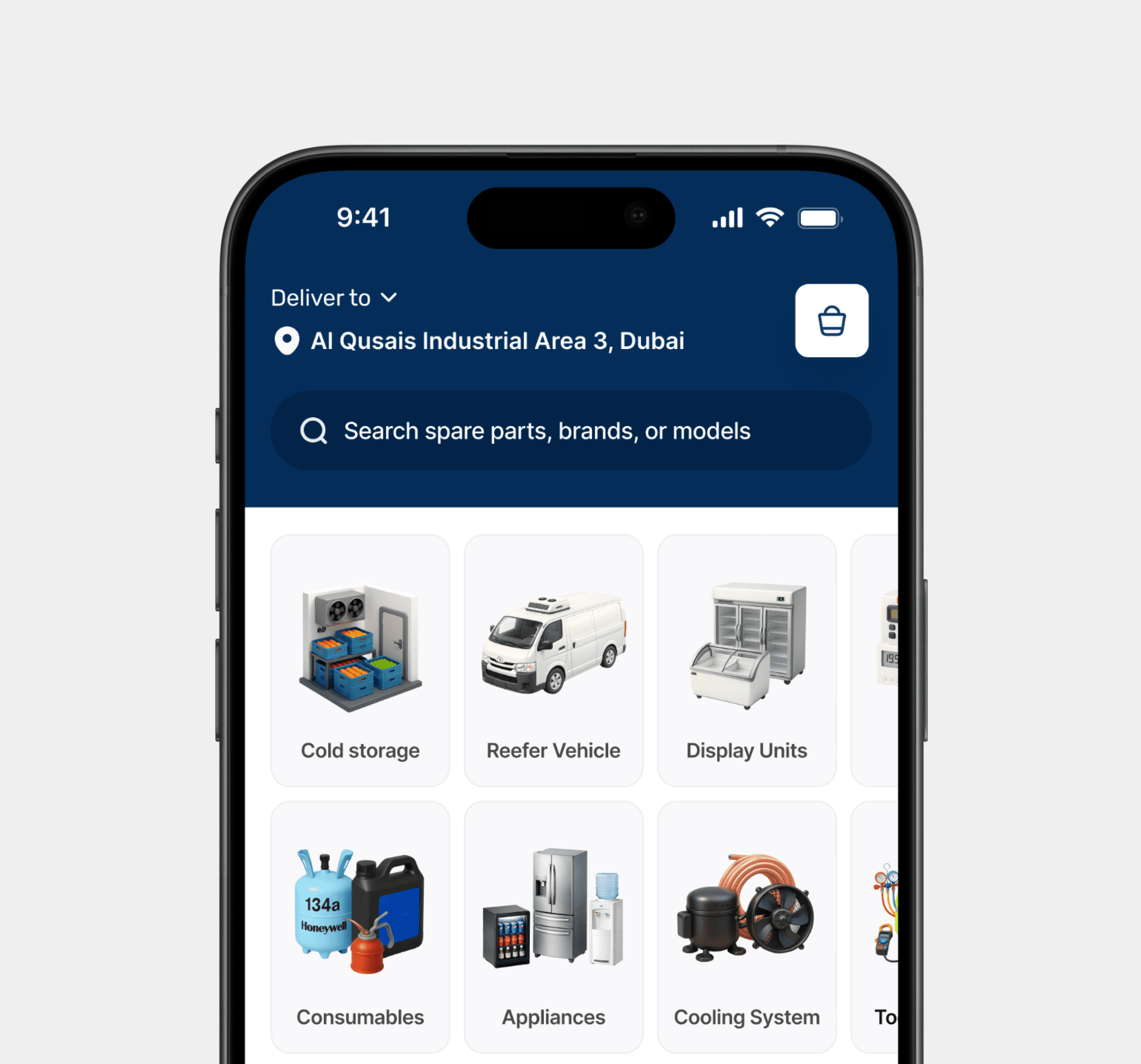
Cold Transport

se of refrigerated vehicles (reefers) and containers equipped with cooling units for road, sea, or air transit.

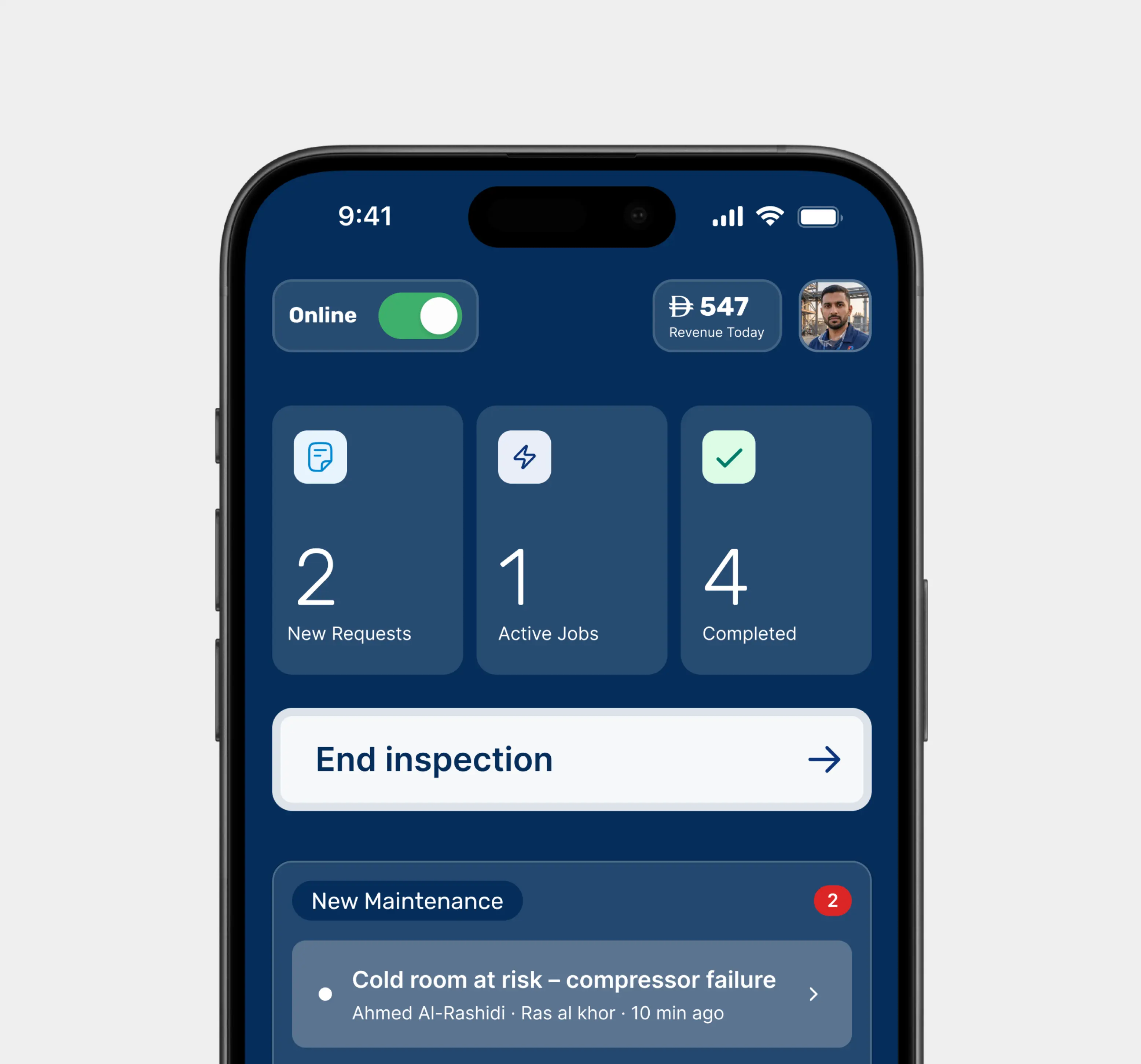
Temperature Monitoring

IoT sensors and real-time alerts that track environmental conditions and ensure the chain remains unbroken.

Value-Added Services

Specialized handling, packaging, and digital audit trails for compliance.

The problems in this
Industry.

Decades of messy operations, in the Emirates

No emergency channel

Breakdowns were reported on WhatsApp to personal contacts. No SLA, no ETA, no confirmation. Customers had no idea if help was coming or when.

No inspection record

Technicians completed jobs but kept no digital inspection records. Customers couldn't verify what was checked, what was replaced, or what was found.

Unqualified dispatching

A cold room technician was often sent to fix an AC unit. No skill-matching, no equipment-type routing. First visit was often wasted.

Zero job visibility

Once a technician was dispatched, the customer went silent. No status updates. No way to know if the technician had even started the job.

The Solution for this
Industry.

From fragmentation to a single operational backbone

Booking entry point

Users think "my cold room is broken" - not "I need refrigeration maintenance". Routing by equipment also enables automatic skill-matching.

Emergency path length

At 2am with a broken cold room, users won't fill a long form. We capture the minimum - equipment type, brief description, location - and gather details later.

Technician skill routing

Sending an AC tech to a reefer vehicle was the single biggest complaint from field research. Skill tags on technician profiles prevent this at the routing layer.

Fault-approval gate

Eliminates the #1 post-service dispute: unexpected charges. Customer must approve findings + cost estimate before work continues. Trust is designed in, not bolted on.

The system before
the screens.

I started by critically re-evaluating the initial ideation wireframes. They couldn't carry the weight - the UX and flows needed substantial optimisation to meet the business, so we rebuilt the foundation from the ground up. Rebrand, information architecture, task flows, foundational design system, high-fidelity prototypes, A/B treatments, dev handoff.

4 structural decisions held the whole thing together.

3-sided marketplace.

Not customer + provider. Customer, technician, and ops backbone - 3 sides, designed in parallel.

Twin apps, one spine.

Customer app + Technician app. The site reality and the desk reality were never going to share a screen.

5 module consolidation.

Maintenance, Rental, Shops, AMC, Installation - each with its own deeply customised flow, one shared language.

Phased rollout

Cold storage maintenance first, then AC repair, then automotive AC. Sequenced by impact, not engineering convenience.

-

Process

Process

Situation

Decision

Outcome

1

Rebuild the home
from scratch

Rebuild the home from scratch

The first home I inherited was not good enough for this audience. No real UX. No real UI.

Situation - The first home I inherited was not good enough for this audience. No real UX. No real UI.

Scrap it. Consolidate the product into five module doors, each a front-door into a customised flow.

Decision - Scrap it. Consolidate the product into five module doors, each a front-door into a customised flow.

The home stopped being a surface and started being a decision made in seconds on the warehouse floor.

Outcome - The home stopped being a surface and started being a decision made in seconds on the warehouse floor.

2

Split customer
and technician.

Split customer and technician.

We tested many maintenance versions trying to model real-world work. Single-app role switching compromised both users.

Situation - The first home I inherited was not good enough for this audience. No real UX. No real UI.

Two apps, shared spine. Bridge the concept and the flow for both user types inside the same system.

Decision - Scrap it. Consolidate the product into five module doors, each a front-door into a customised flow.

Problems cut in half. No approvals. No callbacks. No paper. No separate accounting. No pending-payment chasing.

Outcome - The home stopped being a surface and started being a decision made in seconds on the warehouse floor.

3

Make Shops a technical catalogue, not a generic store.

Spare parts are gases, electricals, doors, machines, tiny hardware. Units in kg, tons, litres, length, height.

Situation - Spare parts are gases, electricals, doors, machines, tiny hardware. Units in kg, tons, litres, length, height.

Keep the commercial frame, but engineer a per-product option picker that resolves before the add-to-cart button is reachable.

Decision - Keep the commercial frame, but engineer a per-product option picker that resolves before the add-to-cart button is reachable.

One catalogue can sell a ton-weight machine and a small fitting - without breaking. Opened the door to B2B.

Outcome - One catalogue can sell a ton-weight machine and a small fitting - without breaking. Opened the door to B2B.

4

Push back on the
inherited brand.

Push back on the inherited brand.

The existing brand identity didn't carry the product's ambition or the industry's seriousness.

Situation - The existing brand identity didn't carry the product's ambition or the industry's seriousness.

Revamp the full logo + identity, and accept that the ripple would touch operational choices, not just visuals.

Decision - Revamp the full logo + identity, and accept that the ripple would touch operational choices, not just visuals.

A visual system that carries five modules + two apps without fracturing, and talks to a 25–60 year old operator directly.

Outcome - A visual system that carries five modules + two apps without fracturing, and talks to a 25–60 year old operator directly.

The Architecture
with some info

Mapping out the hierarchy and structural logic of the experience.

Five doors. Two apps.
One operational spine.

A guided walkthrough, not a gallery. Each screen carries a decision behind it: what it replaced on the warehouse floor, and why the design lands this way.

Screen 01 · Home

Five doors, no hesitation.

The home lands on the five modules - Maintenance, Rental, Shops, AMC, Installation. Each with a clear iconography pass and a one-line promise underneath. The job is decision speed. A user on a warehouse floor should know within seconds which door they came for.

Decision

Consolidated home over generic service tiles.

Replaces

The call to "whoever picks up first".

Screen 02 · Maintenance request

Pick the problem before the technician.

The maintenance flow starts with the asset and the symptom, not the service category. The user selects the affected equipment (cold room, chiller, reefer, automotive AC), then drills into the specific issue with a set of chips. The technician receives a structured job, not a paragraph of phone-call notes.

Decision

Asset-first, category-second.

Replaces

Three decades of free-text call notes.

Screen 03 · Rental

Reefer trucks and cold storage-chosen by the cargo, not the spec sheet.

The rental module asks what you're transporting or storing first, then matches the vehicle type and cold storage profile. I designed the entry step around the asset - the user knows their cargo better than they know the vehicle spec.

Decision

Cargo-first configuration.

Replaces

A broker on the phone guessing capacity.

Screen 04 · Shops product details

Custom option pickers above every add-to-cart.

Every product page renders the exact configuration that part needs: size, weight, volume, spec, model data. Add-to-cart only unlocks once configuration resolves. Spent the most iterations here. One SKU is a gas canister; the next is a cold room door. Replaces: callbacks asking "which size did you mean?"

Decision

Per-product configuration gate.

Replaces

Callbacks for "which size did you mean?"

Screen 05 · Technician app

The technician's app
built for the job, not the desk.

Job queue, site details, parts picked, time logged, fault notes, customer signature, all on-site, all in the system before the tech leaves. No paper. No pending-payment calls

Decision

Twin app, not role switch.

Replaces

Paper invoices and awkward chase calls.

The before & the after
Home was the most visible fix.

  • Before · what was wrong

Not good enough for this audience.

Inherited wireframe. No real UX or UI. A placeholder wearing the costume of a home screen.

-

No clear entry into the five service categories

-

Weak hierarchy — a 25–60 year old operator can't scan it

-

No visual language tied to the cold chain context

-

No place for the customised module flows to live

  • After · what got fixed

A home that earns the decision.

Rebuilt from scratch. Five module doors, a clear iconography pass, & a visual system tied to the industry the product actually serves.

+

Five distinct module entries — each into its own flow

+

Hierarchy works for fast-scan users on warehouse floors

+

Design system carries down into the technician app

+

Brand identity revamp ripples through operational choices

What the design
was built to deliver.

Honest note: backend issues, API bugs, and App Store approval cycles delayed full real-world testing during my engagement. So this isn't a victory lap. It's what the product was designed to do, and the internal-pilot wins the stakeholder and I could already observe.

Problems cut in half. No approvals. No callbacks. No paper. No separate accounting. No pending-payment chasing.

0

Operational friction cut.

Stakeholder's own words on the internal pilot , every step the app now handles is a step a phone call used to cover.

0

Service lines consolidated.

One app now carries what used to live across five separate operational silos.

0

Phone-call workflow

compressed into a structured request, dispatch, and record system.

0

Per-unit record capture.

Every service interaction and transaction recorded and saved within the app.

Design System,
Made for scaling.

Reusable components, structured tokens, consistent patterns. Carries five modules and two apps without fracturing. One system, no visual surprises.

The Battle Field .

Visualizing the final interface through a cohesive design system.

Behind the
scene's & sweat.

A lot of Figma frames, and enough egg puffs to fuel a redesign. The real work happened in the decisions we argued over, not the pixels we pushed.

Like what you see?
Book a free discovery call.